On this page:
- Launch your design system into hyperdrive with Startshot’s Experience Builder – a summary.
- What is Starshot Experience Builder?
- How design systems and Starshot Experience Builder work together
- Understanding Single Directory Components (SDCs) in Experience Builder
- Tips for building usable components
- CivicTheme and the future of SDC compatibility
- Conclusion
The main focus of Akhil’s session at DrupalSouth Melbourne was showcasing how Starshot Experience can streamline the use of design systems in Drupal CMS. Drawing from Salsa Digital’s experience across multiple government design systems, Akhil explained how Experience Builder empowers non-technical users to build flexible, component-driven pages using Single Directory Components (SDCs) while maintaining visual consistency and governance.
Launch your design system into hyperdrive with Startshot’s Experience Builder – a summary.
The main focus of Akhil’s session at DrupalSouth Melbourne 2025 was introducing Starshot Experience Builder, a powerful new tool that brings visual editing capabilities to Drupal CMS. Designed to empower marketers, designers and other non-technical users, Starshot Experience Builder allows teams to create and update landing pages directly in the browser using reusable components built with Single Directory Components (SDCs). Akhil highlighted how this tool fits into the broader vision of Drupal by combining flexibility, scalability and design system governance, while reducing the need for developer intervention.
What is Starshot Experience Builder?
Starshot Experience is a new user-facing layer in Drupal CMS that aims to simplify page creation for non-technical users, especially marketers and content editors. Experience Builder was introduced as part of the broader Starshot vision and lets users build and edit rich landing pages directly in the browser using intuitive layout tools.
During his walkthrough, Akhil showcased how the Experience Builder moves beyond traditional Drupal approaches by allowing drag-and-drop editing, real-time layout adjustments and modular component placement. These components can include everything from hero banners to cards, list views and even prebuilt sections.
Rather than relying solely on backend configuration, users can now assemble and customise pages in a more visual, hands-on way, reducing the need for developer intervention. While the tool is still in active development, it has a clear direction to provide site builders with a flexible, approachable interface that balances Drupal’s structure with the creative freedom of modern UX tools.
How design systems and Starshot Experience Builder work together
Akhil emphasised that while Starshot Experience Builder offers flexibility and power, it’s the integration with design systems that brings consistency and control. Design systems act as the guardrails that ensure page layouts and components not only look good but also follow a clear, repeatable structure.
In practical terms, this means design systems define the styling, spacing and behaviour of reusable UI components, while Experience Builder offers the tools to assemble them into full pages. The combination allows teams to maintain brand consistency across pages without sacrificing speed or autonomy.
Akhil referenced multiple design systems Salsa has worked with, including , the AUDS and Victoria’s government design . In each case, the goal was similar: reduce design drift, improve maintainability and give teams a shared language across design, development and content creation.
By pairing a well-defined design system with the editing power of Experience Builder, Drupal CMS moves closer to offering an enterprise-grade site-building experience for users of all technical levels.
Understanding Single Directory Components (SDCs) in Experience Builder
Akhil explained that Single Directory Components are the building blocks behind the components used in Starshot Experience Builder. Each SDC lives in its own folder and includes all the files it needs to function: a Twig template, CSS, JavaScript and a metadata file written in YAML.
That YAML metadata is what defines how each component behaves. It includes things like:
- A human-readable name and status (e.g. stable, experimental)
- A list of props—predefined inputs like title, description or button links
- A list of slots—open placeholders that allow authors to insert other content
This separation of props and slots gives content editors both structure and flexibility. Props help lock in consistent design and reduce the chance of errors, while slots provide space for customisation when needed.
But Akhil also warned about the risks of too much flexibility. For example, if a slot is left completely unrestricted, a content editor might accidentally insert a large component inside a card or banner, breaking the intended layout. While slot restrictions are expected in future releases, for now, it’s up to teams to set internal standards and usage guidelines.
Finally, Akhil highlighted how SDCs are aligned with atomic design principles. Each component is self-contained, meaning teams can reuse and combine them easily across pages, making Drupal development more modular and efficient.
Tips for building usable components
Drawing from Salsa’s experience building multiple design systems, including and the Starshot demo, Akhil shared a series of practical tips to ensure components remain usable, consistent and easy to manage.
Prioritise the authoring experience
While end users may not notice what’s happening behind the scenes, the real challenge lies in making the editing experience smooth for marketers, content authors and site managers. Akhil encouraged teams to think about who will be using the components—and how often—and tailor complexity to fit their needs.
Be intentional with props and slots
Slots offer flexibility, but they can also introduce confusion if misused. Too many open slots make it hard to maintain consistency. Instead, Akhil recommended:
- Using props for standardised content (titles, descriptions, buttons)
- Limiting slots to areas that truly require flexibility
- Avoiding layouts where one slot can accidentally break another
Use clear naming and helpful placeholders
Component names, prop labels and slot descriptions should be meaningful and intuitive. Akhil also suggested using smart placeholder content to guide editors and avoid misinterpretation.
Combine similar components and limit visual options
To avoid overwhelming content authors, group similar components together and restrict styling options. For instance, rather than offering endless layout combinations, use padding components or predefined section templates that can be reused across the site.
Plan for section reusability
Advanced users can create full-width reusable sections (e.g. a callout or contact panel) that can be saved and reinserted into other pages. This not only speeds up page creation but reinforces consistent branding and layout.
Overall, these tips were less about technical implementation and more about making sure the design system works for people, not just code.
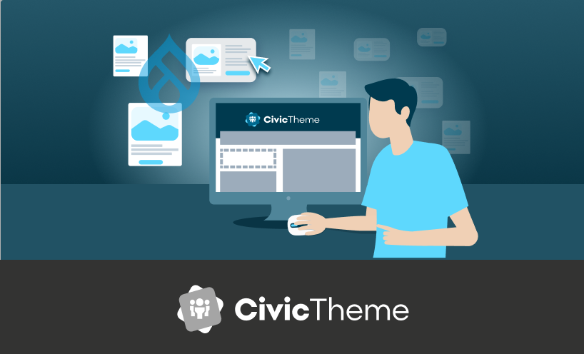
CivicTheme and the future of SDC compatibility
As part of the broader vision for Drupal CMS and the Starshot Experience Builder, Salsa Digital is actively working to make CivicTheme compatible with Single Directory Components (SDC). Akhil outlined the team’s phased approach and progress so far.
Discovery and strategy
The initial research and discovery phase, now complete, explored how CivicTheme could adopt SDC principles while maintaining flexibility and accessibility. The team used the Starshot demo design system (launched at DrupalCon Barcelona) as a testing ground to validate ideas and anticipate integration challenges.
Proof of concept and outreach
With early concepts tested and refined, Salsa has engaged stakeholders to ensure the updated CivicTheme continues to meet real-world needs. Feedback from the community has shaped key decisions around component design and user workflows.
Upcoming development
A full implementation project is now kicking off (as of mid-May 2025). The goal is to convert CivicTheme’s component architecture into SDC format and ultimately integrate with Experience Builder. This will allow CivicTheme users to create, manage and reuse flexible components, without relying on traditional theming workflows or advanced development skills.
Akhil described this as a significant evolution in how design systems interact with Drupal sites, especially for teams who want to maintain consistency while empowering non-technical users.
Conclusion
Akhil’s session at DrupalSouth Melbourne highlighted how the Starshot Experience Builder represents a step-change in how design systems are integrated into Drupal workflows. By combining flexible tools like SDCs with an intuitive, drag-and-drop interface, Drupal CMS is becoming more accessible for non-technical users, without compromising on design consistency or scalability.
With CivicTheme’s roadmap moving toward full SDC compatibility and Experience Builder integration, government agencies and large organisations will soon be able to launch fully branded, user-friendly sites faster and with less developer overhead. It’s a shift that brings Drupal closer to its goal of delivering a powerful, no-code experience for ambitious site builders.
About Akhil Bhandari
Based in Canberra, Akhil works with our Federal Government clients and our tech team, translating business requirements into digital solutions. Akhil works with our clients from project discovery to launch, making sure projects run smoothly, on schedule and on budget. Akhil also has strong technical skills, which means he can more effectively ‘bridge’ the gap between the client and Salsa’s tech team...talking tech to the developers and plain English to the clients.
Related case studies
CivicTheme — designing and growing a government design system
Designing and growing a high quality design system to help government departments create websites quickly, easily and at reduced costs.