At a glance
$51K-$100K
2016
Completed
GovCMS
Federal government
Design & user research
Whole of government
The purpose
To improve the look and feel of the GovCMS default theme to deliver a more visually appealing whole-of-government solution.
The players
The Department of Finance (DoF) launched govCMS as a fully managed content management system (CMS) for government websites in March 2015. Built on Drupal and using Acquia’s cloud hosting services, GovCMS provides a robust, enterprise-grade CMS that’s also open source so modules can be re-used across state, federal and local governments (and the wider Drupal community).
The problem
The ‘out-of-the-box’ GovCMS design needed a lot of work. It was based on a legacy government template that:
- Was outdated
- Was visually unappealing
- Provided a poor user experience and functionality
- Looked clinical and sterile
The DoF was worried that having to invest in design as well as migration or site creation would discourage small agencies from using GovCMS and needed someone to transform the user interface.
The brief
The new GovCMS default theme needed to be designed for government departments wanting to set up a small to medium-sized website inexpensively, that they could take ‘off the shelf’ with as little adaptations as possible.
New visual/theme design
The DoF wanted a contemporary theme to refresh and update new GovCMS sites. The design needed to be flexible, scalable, fully responsive, fully accessible and visually appealing. The design brief was focused on creating a new user interface and look and feel that was:
- Clean
- Modern
- Content-focused
- Uncluttered
- Clearly recognisable as government
- Predictable and conventional in terms of user-centric, functional design
Furthermore, there were new digital design emerging from the called the Gov.Au — a collection of HTML, CSS and JS components reflecting the design guide for building Australian Government services.
The solution
In March 2016, Salsa Digital was brought in to design the new GovCMS template. The design challenge was clear from the outset: to produce a design that was flexible enough to meet the needs of every government department while also being functional and aesthetically pleasing.
Theme design is different from website or app design. The elasticity and flexibility of the theme is critical to ensure any department can use GovCMS. For example one aspect was how to design a site that can support any brand palette. Our solution was to create a ‘design scaffold’ using clean typography and well-balanced design grids.
Our design process
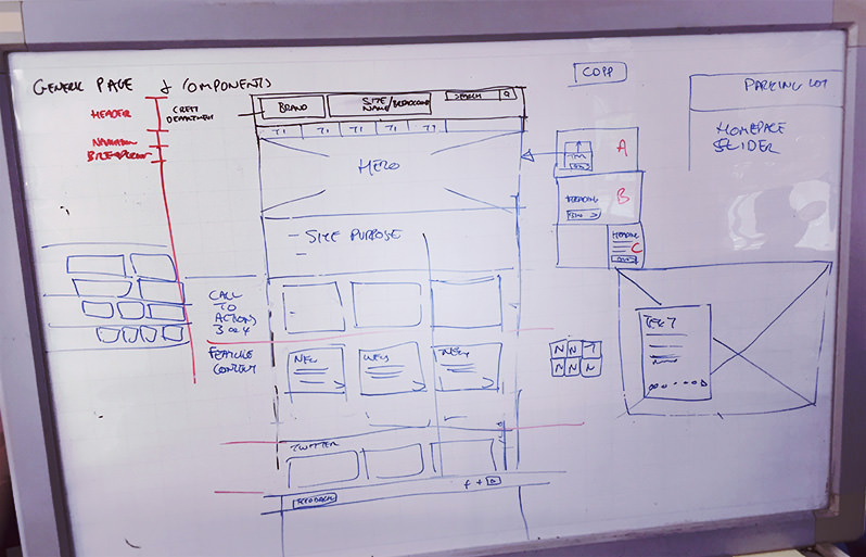
Two weeks of creative workshops ensured we had a shared vision of the design goals and required outcomes. We co-designed layouts and ideas collaboratively on whiteboards.
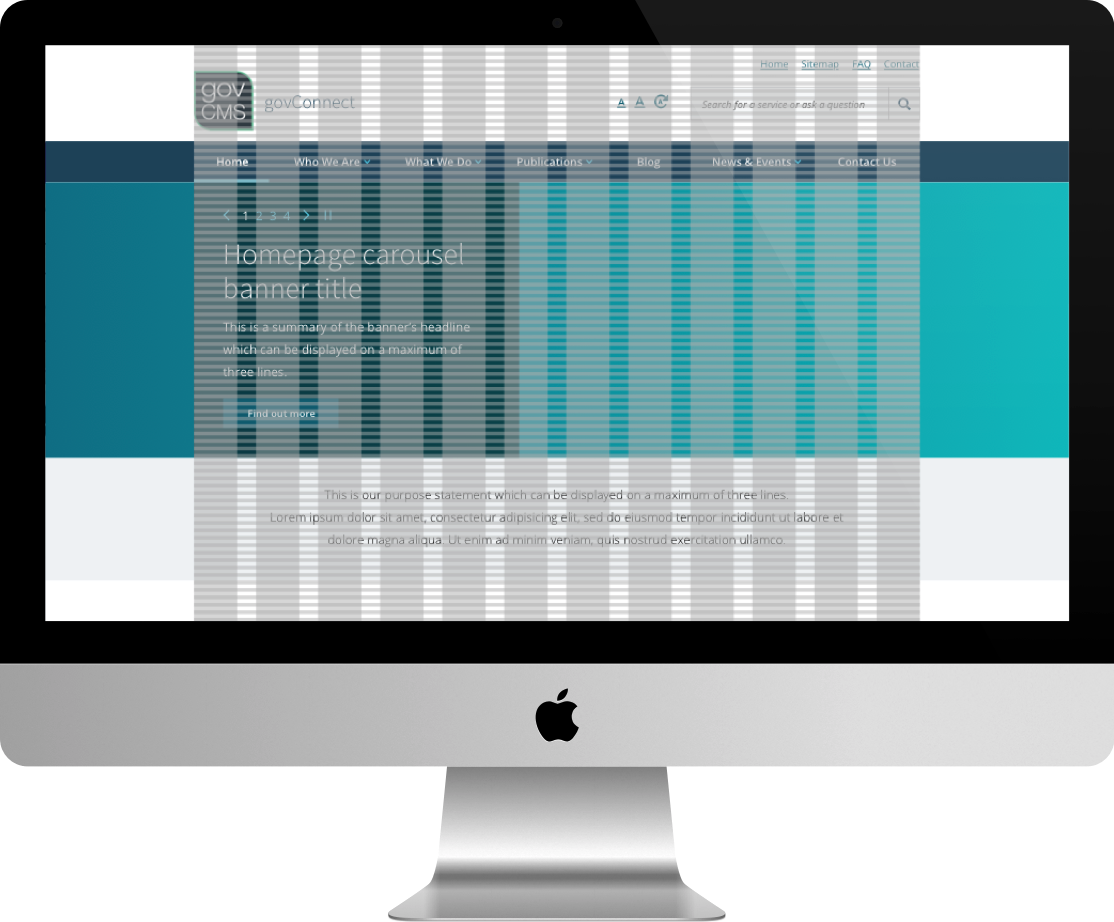
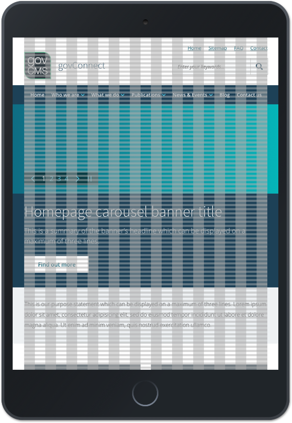
We ended up with a content-focused solution that was designed in a grid pattern across desktop, tablet and mobile (see below). Typography was the foundation for all design elements. For instance we used the body text as the cornerstone for grid calculations.
| Grid design - desktop | ||
|
The grid
Each design is in a 12-column layout, with typically a 30px gutter. The desktop maxes out at 1170px wide. The tablet (portrait) is at 702px wide (768px with 33px padding) and the mobile is 280px wide (320px with 20px padding).
Individual branding
The final design needed to be flexible enough to accommodate almost any colour scheme. We analysed many different government sites and found them to typically use a simple colour palette, often a strong primary and secondary colour scheme. Given this, we decided that the underlying design framework colour scheme should be monochromatic using dark grey and white, while allowing the site owner to designate their primary and secondary colours. This offered the greatest flexibility in accommodating most colour schemes and enabled site differentiation within the broader GovCMS suite of sites.
Page layout
The collaborative working group also formed a framework functional information architecture (IA) to identify page and template types that would typically be needed for small to medium government websites. From there, we used wireframes to nut out layout and different types of content pages.
Agile methodology
Following an agile methodology, we were able keep feedback loops extensive, but tight. Daily client feedback meetings ensured we were always on track and that the DoF was always up to date. We used Invisionapp interactive prototyping to gather remote feedback.
All pages were validated for responsiveness, technical requirements, brand, user experience (UX) and adherence to Web Content Accessibility Guidelines (WCAG). Feedback from the client and the validation processes was then used to fine-tune the Salsa solution.
Page layouts/types
The homepage layout contains :
- A place for feature imagery
- A place for quick links
- A place for latest news and a Twitter feed
Category pages contain:
- A feed of latest news (blog) items and media releases
- A way to feature a news item
- A Twitter feed
- Links to news by type
- An area to put media contacts, subscription services, etc.
Content pages contain:
- Secondary navigation (will only appear if there are multiple content pages in a section)
- Page title
- Examples of different content layouts:
- Short and long paragraphs
- Text and images together
- Lists (e.g. lists of publications)
- Tables
- Content highlight styles such as block quotes and pull-out quotes
- Up to three levels of headings
- Icons for social media shares, print, and email.
We were also challenged with leveraging the very new UI-Kit 1.0 by the . The is essentially a collection of HTML, CSS and JS components reflecting the design guide for building Australian Government services. (In late 2017 this was later upgraded to work with UI-Kit 2.0 with Drupal 8 - see related blog post here.) The challenge was to ensure we kept up and aligned the changes that were evolving quickly, you’ve got to love agile :)
Salsa Digital focused on designing a ‘template’ that, when customised, could give each GovCMS site individual personality. The template was also designed to work with many different GovCMS functional modules.
While this balancing act meant we couldn’t be wildly creative or develop different page designs/styles for each type of page, we could still bring our unique design flair to a template solution.
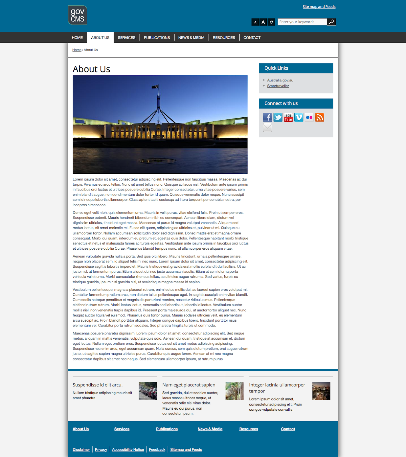
Desktop top fold |
Desktop middle fold |
Desktop bottom fold |
The new GovCMS template is:
- Visually appealing
- Inviting
- Responsive from all devices
- AA compliant
- Modern
- More citizen-friendly and less government-looking, while meeting the necessary government ‘branding’ requirements
Tablet top fold | Tablet next fold | Tablet bottom fold |
We think we succeeded in creating an out-of-the-box solution that will engage users and engenders individual department personality.
Mobile top fold | Mobile middle fold 1 | Mobile middle fold 2 | Mobile bottom fold |
The benefits
The benefits of a redesigned GovCMS template are obvious. First and foremost, it reduces the barrier to adoption of GovCMS. The Salsa Digital-designed sleek template solution will entice more government departments to come on board. In addition to all the usual benefits of GovCMS (e.g. an open-source, enterprise-grade, stable, secure, approved and vetted solution) they can now also enjoy a contemporary and appealing visual design that’s guaranteed to work from all devices (desktops, tablets and phones). Plus the template allows for enough customisation that departments can still project their individual styles.
Who’s using it
Here are a few of Salsa Digital’s government clients that have recently benefited from baselining their theme off this new GovCMS design template:
Stay Smart — Stay Smart Online provides simple, easy-to-understand advice on how to protect yourself online as well as up-to-date information on the latest online threats and how to respond.
— Provides member-only access for Parliamentary Clerks to ANZACATT resources.
— VOCAT is established by legislation to provide financial assistance to victims of violent crime committed in Victoria. The website is a primary information source for the public to access this financial assistance and related information.
— Providing life-saving emergency call-taking and dispatch for all Victorians by dedicated professional people and sophisticated technical systems.
— The Australian Government’s primary authority on radiation protection and nuclear safety. Protecting the Australian people and the environment from the harmful effects of radiation through understanding risks, best practice regulation, research, policy, services, partnerships and engaging with the community.
— TEQSA is Australia’s regulatory body that oversees higher education, focusing specifically on quality assurance.
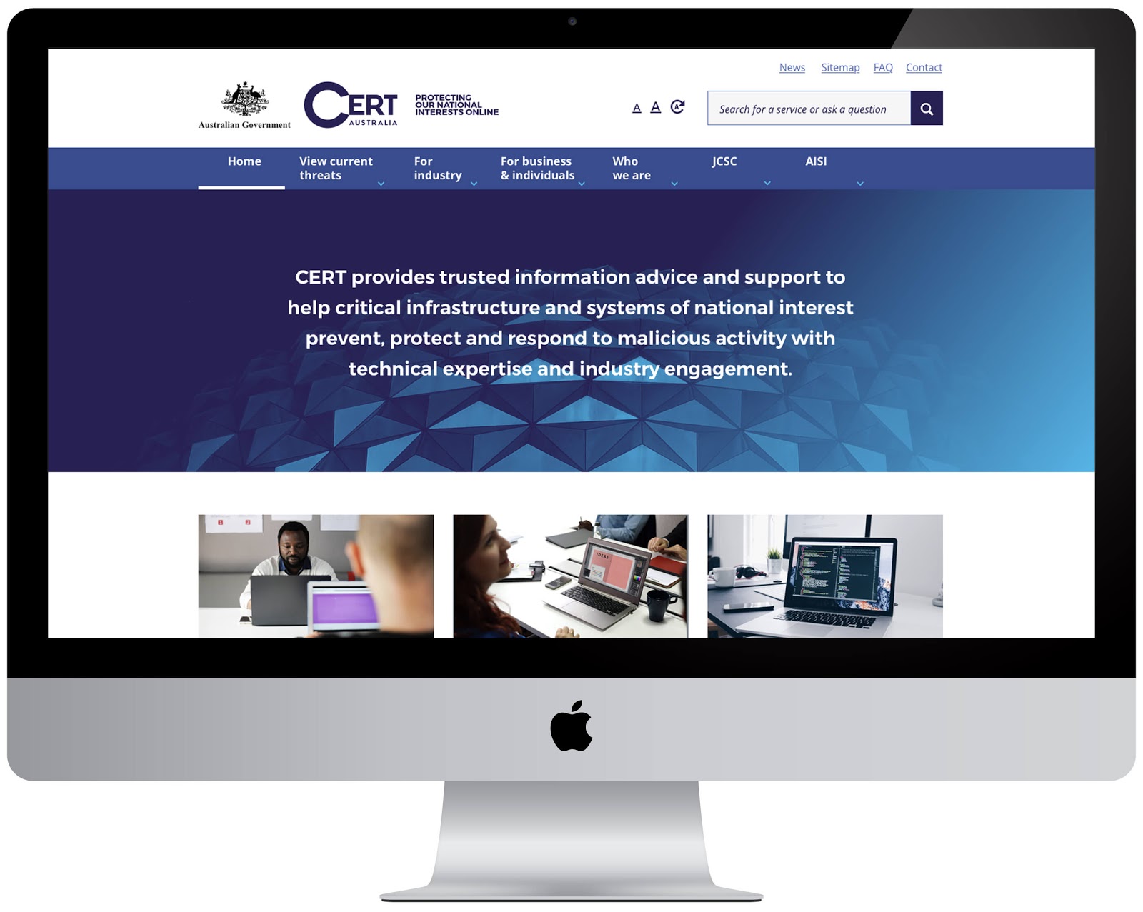
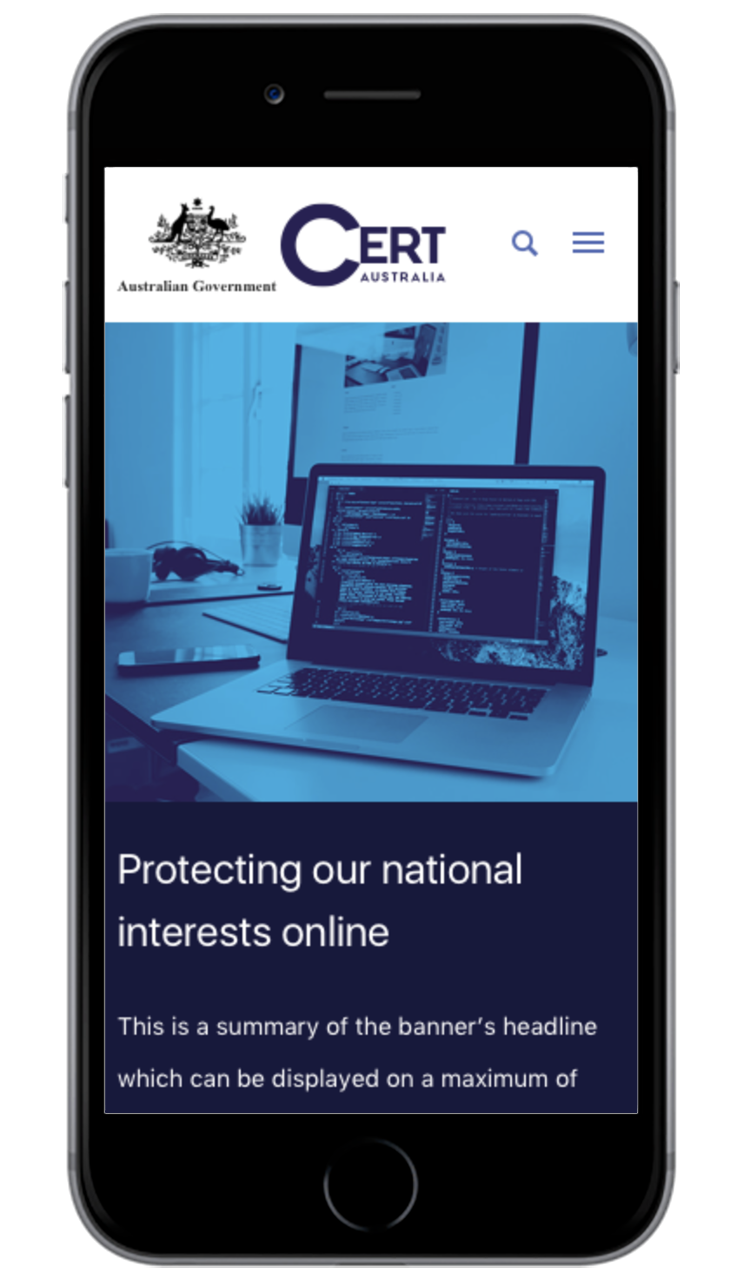
— CERT Australia aims to improve cyber-security resilience in Australia. It does this by partnering with the owners and operators of critical infrastructure and other systems of national interest to support them in maintaining and enhancing their cyber-security resilience.
They provide advice in many forms and also offer a range of services all listed on their website.
Monash University — Ranked within the top 100 worldwide, Monash is an Australian public research university based in Melbourne, Australia. Salsa Digital received permission from DoF to take the new GovCMS designs to produce a design template as part of Monash’s openCMS platform program. We took these designs and themed them on Drupal 8 and Wordpress. Monash’s openCMS sites are hosted on AWS Lightsail. This has further demonstrated how government is saving taxpayer money and creating something that’s reusable across another sector (education).

